Plystakas
building materials hardware store
Plystakas is a hardware store that provides building materials and a variety of high-quality products. Since their first store opened in 1979, they have gained the trust of numerous professionals and regular customers not only because of their variety but also because of the great customer service.
We designed their first website in 2010 and we have had an ongoing collaboration ever since. Apart from the website (currently in its third version) we have designed a complete corporate identity and brand, numerous applications and even elements of the store.
[ client since : 2010 | last update: November 2024 - v.01 ]
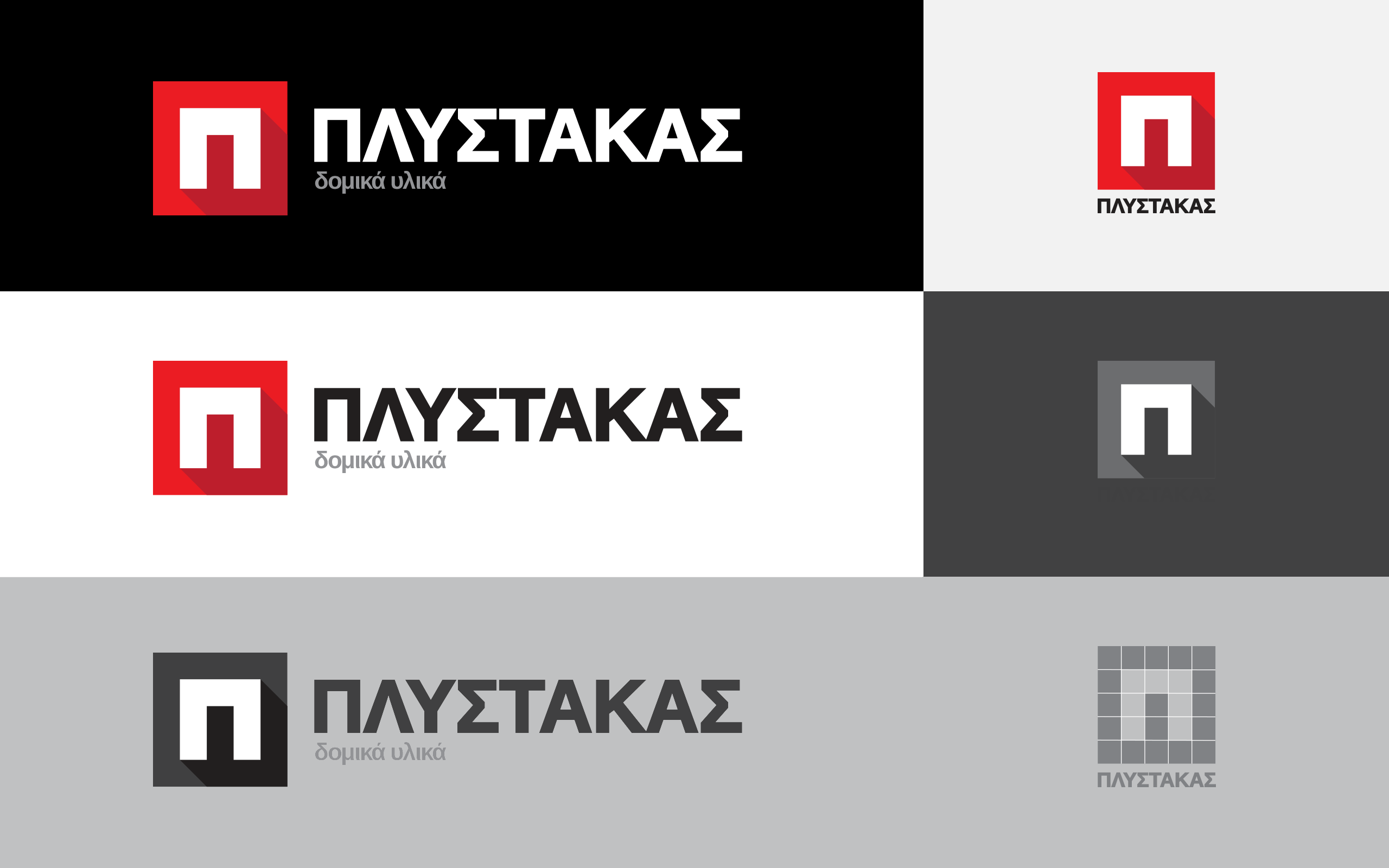
This is the logo we designed for Plystakas. We drafted a set of requirements based on what the logo should project but also considering its applications . The logo should be bold and distinctive even in small size and on very harsh and not carefully curated applications.
We used the first letter (“Π”) of the name in Greek as an icon and with only 3 colors it has the illusion of depth. The color palette accounts for both white and dark background. As usual we provide our customers with an online library with all the necessary files, they need for their work.
The tagline (“δομικά υλικά” – building materials) is simple but direct, we added this in order to compensate for the non-descriptive company name. The logo is almost always used along with something relevant, a product, or a sign, however the tagline is a reminder that even the tiniest thing is a part of something bigger.
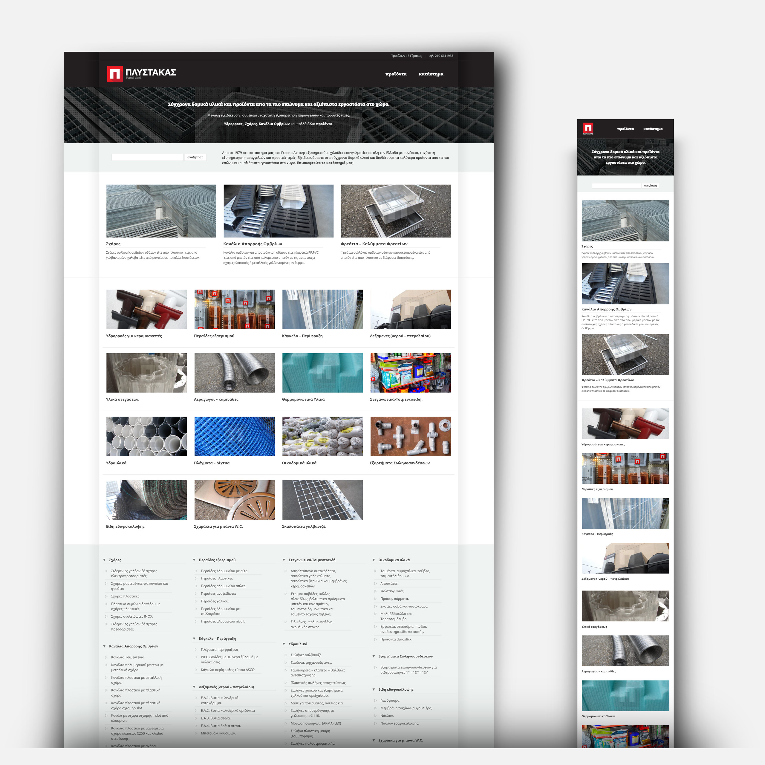
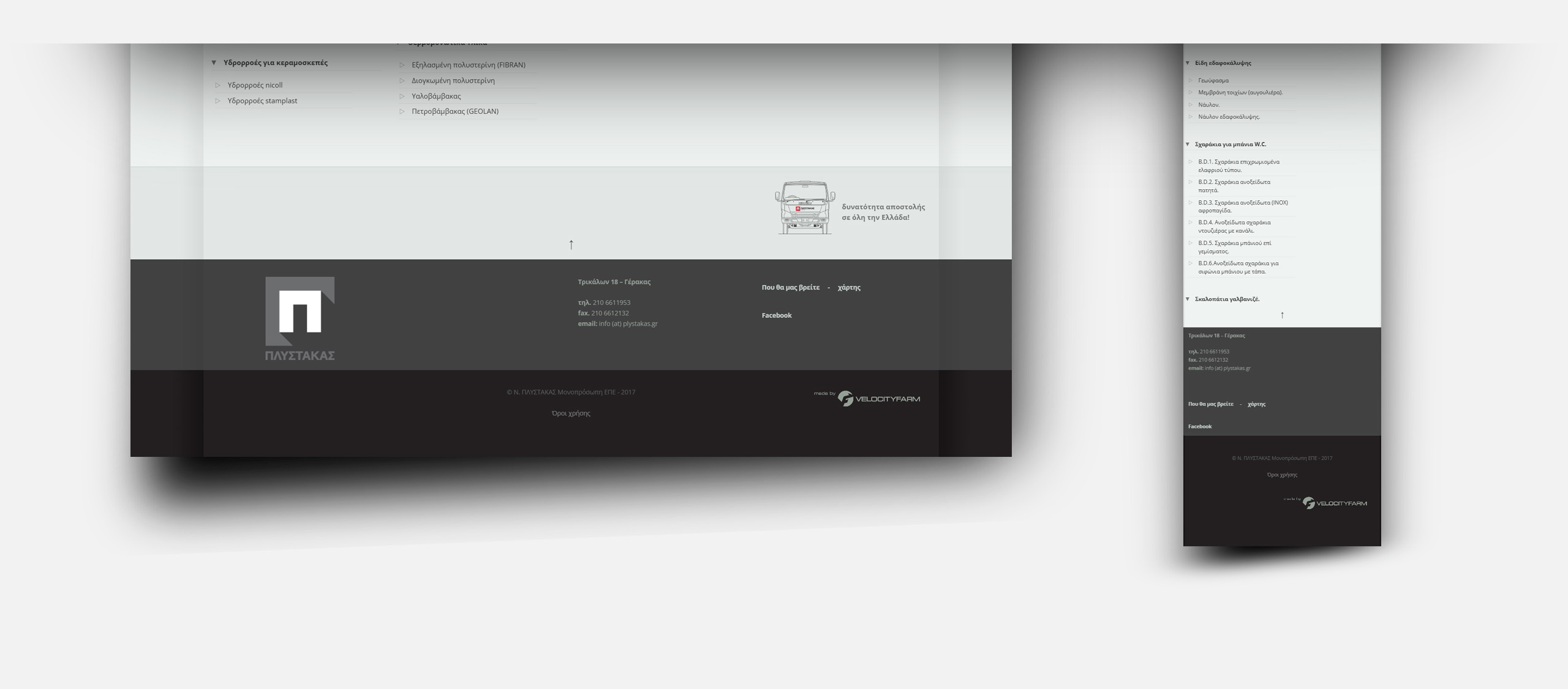
This is the third iteration of the plystakas.gr website after the very first one launched in 2010. As always, the goal was to showcase the company’s products in a very easy to navigate environment (everything is no more than 2 clicks away, usually no more than one!) establish the plystakas brand and also show up as high as possible on google search results. These are not contradictory requirements, designing a clearly structured sitemap is the best fundamental for good SEO.
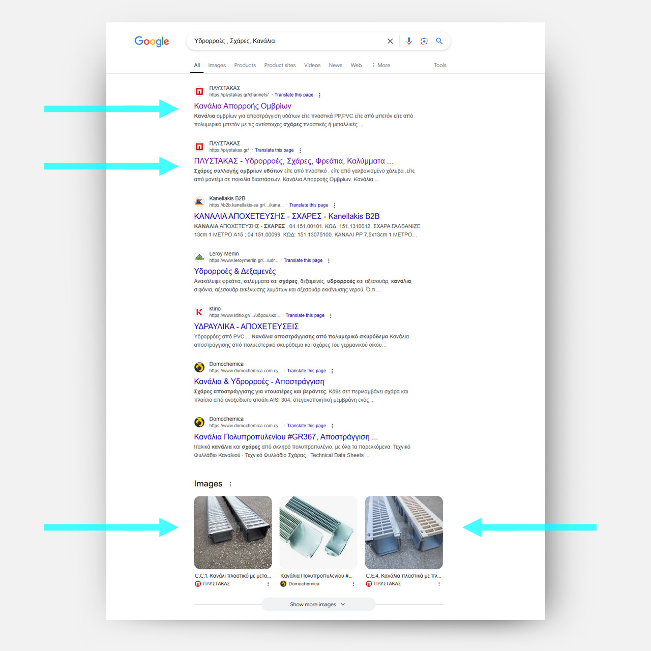
Plystakas.gr is very frequently on top of the results for many relevant keywords, often higher than much larger companies that cannot provide the same customer care. Since the very first website almost 15 years ago we took extra care of the product images, many of those were not very easy to depict due to their nature. This attention to detail not only provides the customers with a clear view of what exactly they will buy, they are very popular on google images as you can see in this example here.
Photos are very important for any product presentation, building materials are not very photogenic so we designed the website in a way that is not strongly reliant on the images. Even so, through the years we have tried our best and shot most of the photos on site with a lot of care, but it was necessary to consider that many photos will be shot by the client on site.
A good website is worthless if it’s not up to date, that’s why we automated as many aspects as possible, menus are automatically generated and each product page is split into content boxes. Adding and modifying new products is very easy and quick.
Design wise the website is primarily functional and utilitarian, like the products and the -mostly- professionals that are interested in them. However, the structure, clear typography and the consistency of the brand elements throughout give an overall quality feel that reflects the actual customer experience of the company.
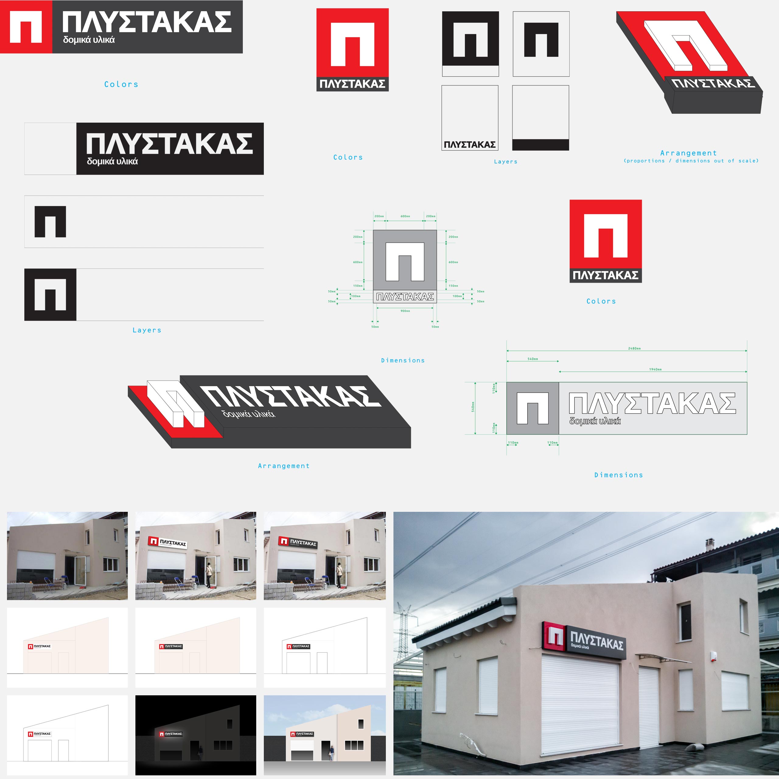
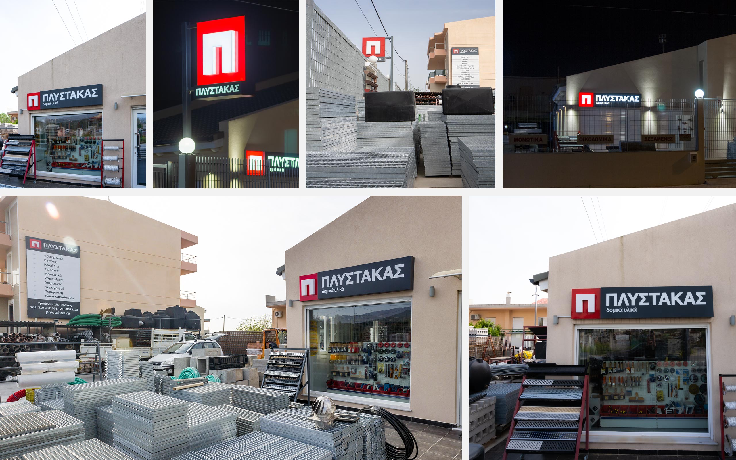
A few years ago, the store was relocated to an all-new establishment. This was a great opportunity to expand the brand to the store configuration. We designed three signs and created mockups to find the best placement and the appropriate design for each one of them. The main one was above the entrance, an illuminated physical 3-dimensional representation of the logo, a big flat one was placed on the adjacent wall with a list of products but the most important is the second 3d illuminated icon. The last one was visible from a great distance, making it easier to spot the store from afar.
We initially examined the store layout, trying potential placements and afterwards we proceed not only with designing the external view of the signs but we also provided layout instructions and overseeing their construction and color accuracy.
You can see here images from the process as well as the finished result
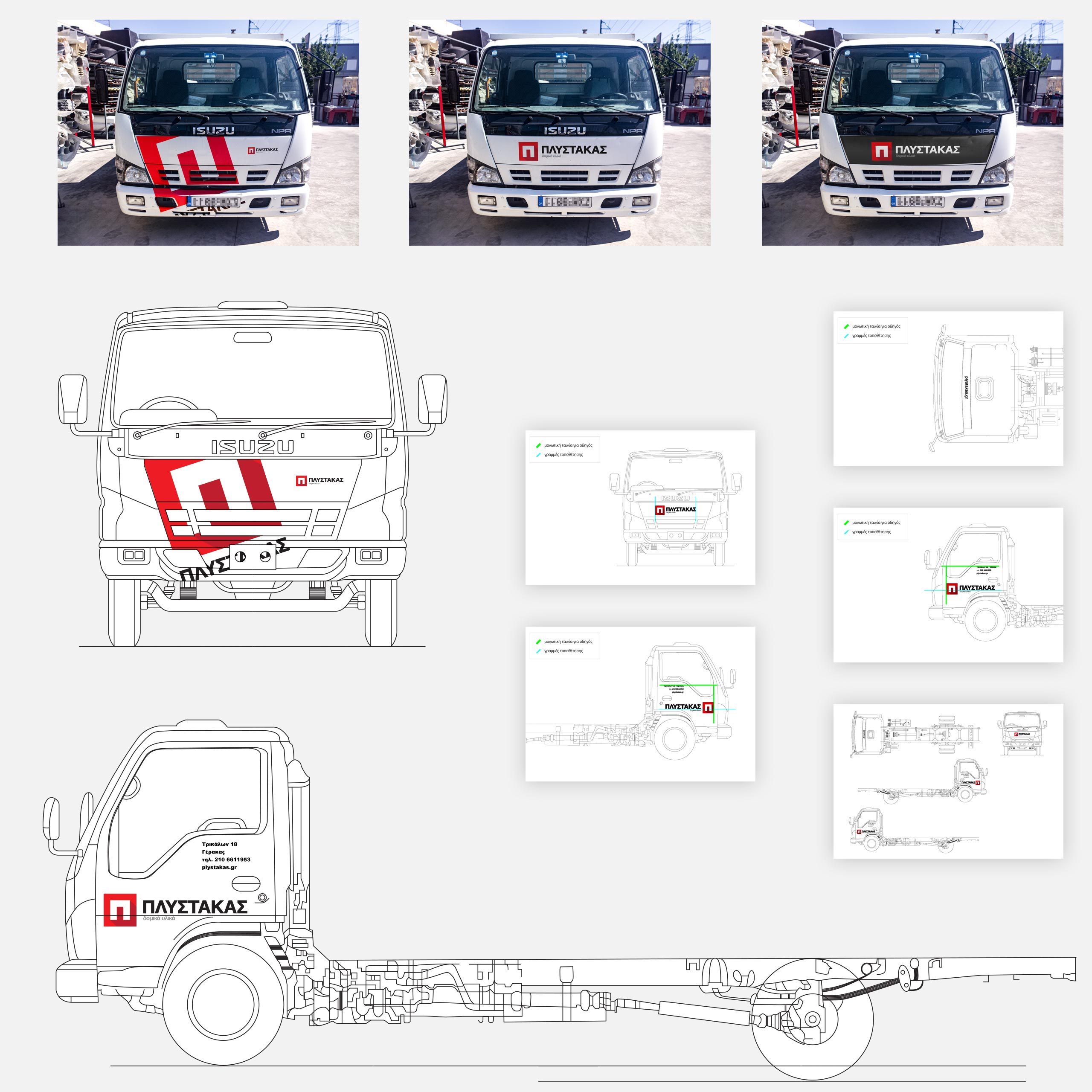
One of the most fun brand applications was the livery of the trucks used by Plystakas. We designed many variations, some more discreet, others not so much so. The client choose amongst the photorealistic mockups and we provided the print files as well as detailed instructions to apply them correctly.
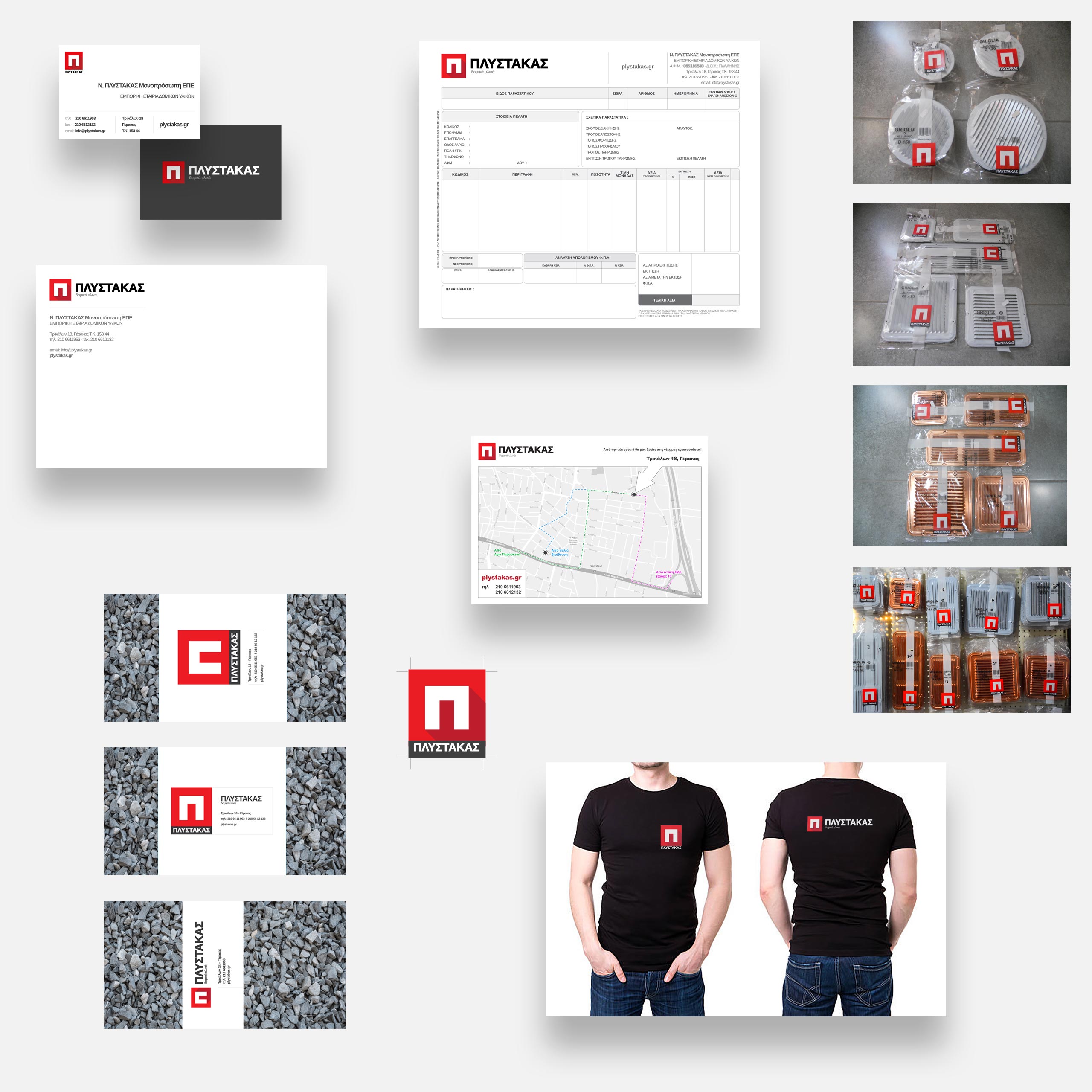
These are some examples of the documents, labels and other applications we designed. As usual we prepare a framework from the brand from which we can create easily and with consistency any deliverable that may be needed.
