ethaca
academic consulting agency
ethaca academic consulting is an international education consulting company that helps students and institutions to meet their educational goals.
ethaca was incorporated in the UK many years ago, providing educational services and products. They wanted to keep a continuity on their brand, so in its current form we preserved the idea behind the logo but redesigned everything else in order to serve the company’s current mission and clients.
[ client since : 2015 | last update: September 2024 - v.00 ]

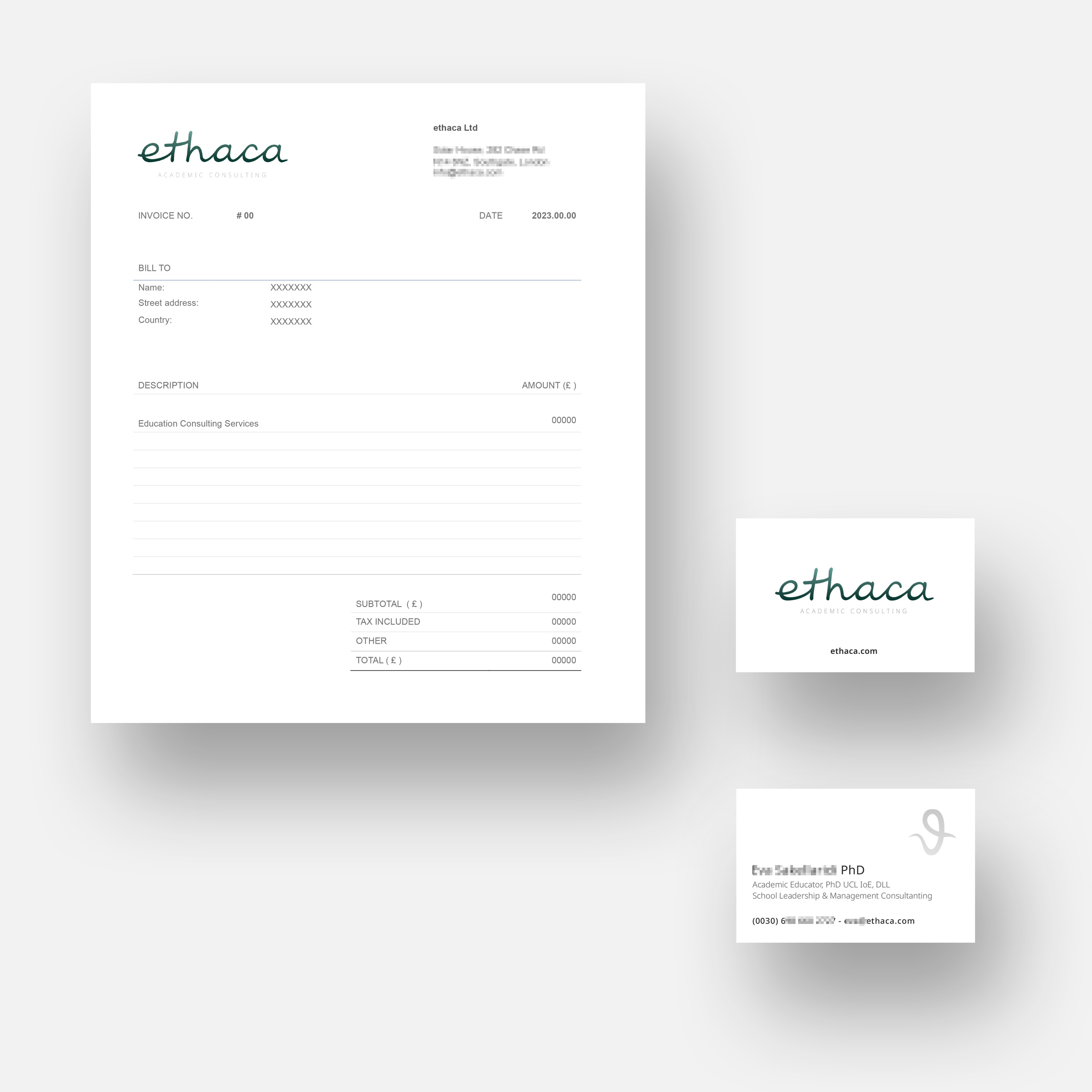
The brand design for ethaca required a discreet approach that reflected the quality and hands-on approach of the company. The design of every brand application is clean and minimal, leaving the playful logo to provide an upbeat tone, always essential in education, in any age!
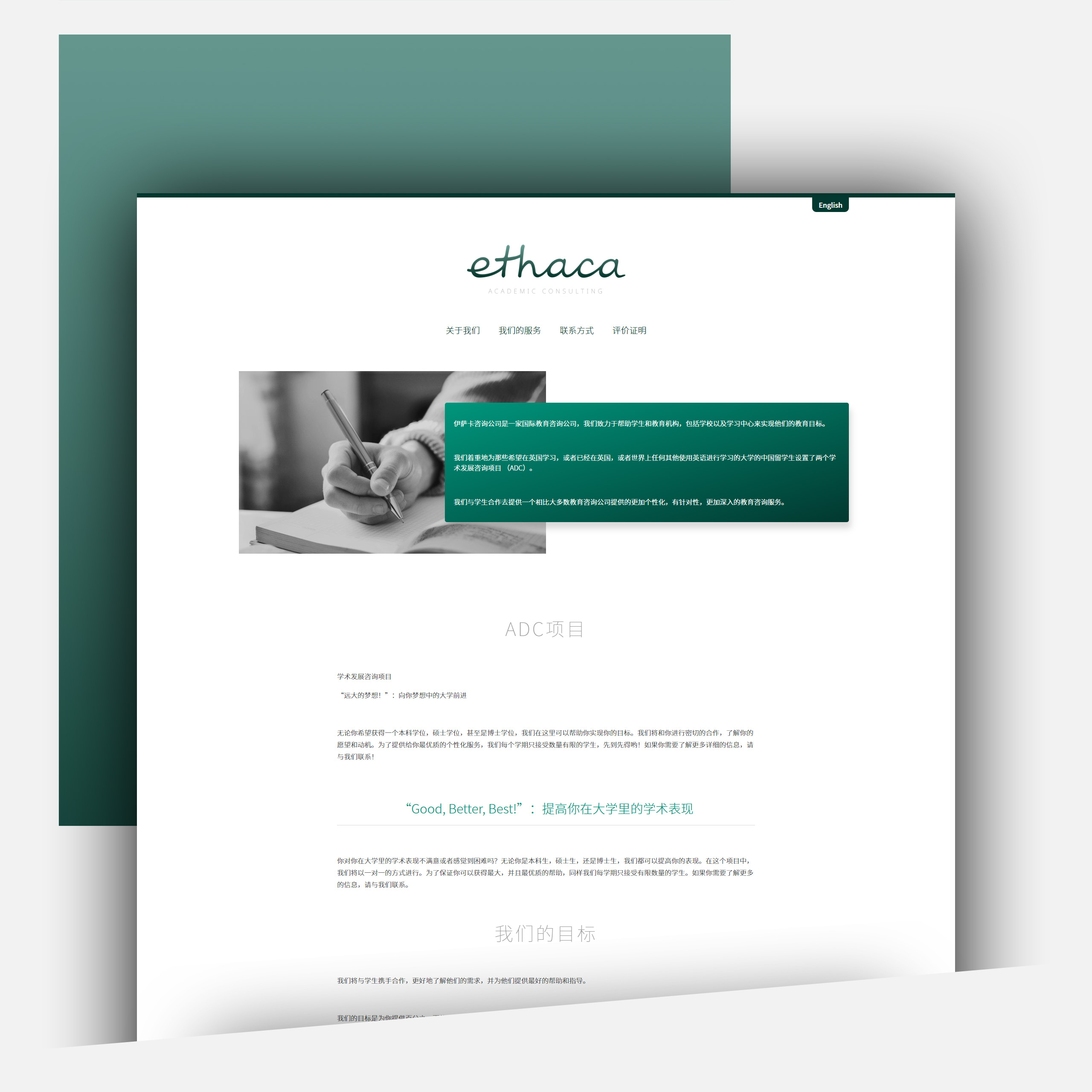
The website is simple, its purpose is to portray the values of the company, the necessary information and easy to access contact details. A substantial part of ethaca’s clientele is from Asia, so the simplicity of the design should transcend a wide spectrum of ages and cultures.


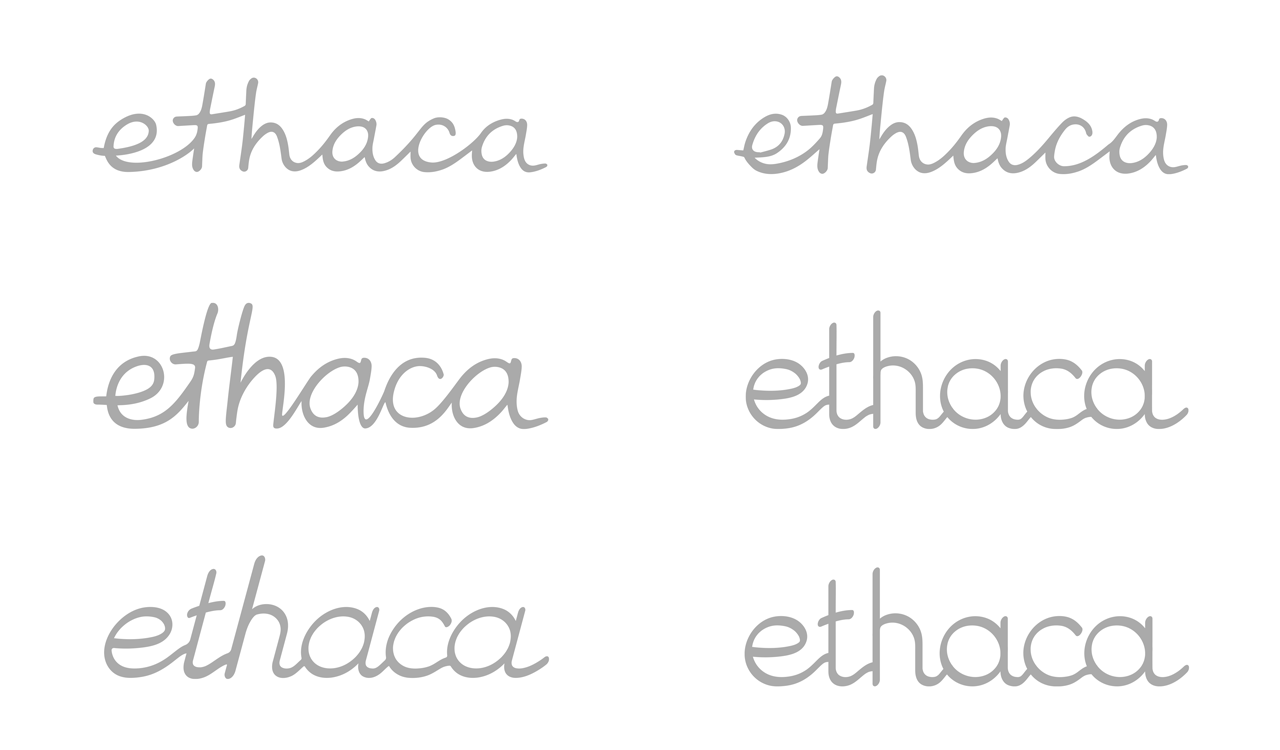
We tried a lot of iterations and fine tuning on the logo, It looks like a handwritten word made in one stroke, but what looks balanced in a piece of paper rarely holds its composure when converted to digital and combined with other elements.

We designed all necessary documents and stationary items. Along with the main logo we designed a monogram, a twist between the Greek letter theta and the letter ‘e’.
