Thoughts on showcasing work

Along with our recent website update we introduced the first new presentations of case studies for works we have completed, starting with these first five (plus a small extra one with some samples).
It’s been quite some time since we have a portfolio like that online, and this post is about some notes on this. It’s a collection of thoughts mostly on the actual act of presenting our self, our agency, and our work to others, whether they are our colleagues, clients, or the public. What to display, how to do it and most importantly why.
§. WHAT – presentations that reflect our approach.
Each presentation is dedicated to a specific client and it may be a small glimpse of the complete work we have completed but it represents this body of work as a whole.
We work closely with our clients, and every deliverable is a step towards a commonly defined goal rather than just a series of products that their need occasionally arises. The way we selected what should be included in every case study reflects that approach. In the past we featured specific products and deliverables separately but we believe that a ‘per client’ presentation is the most appropriate for our practice.
There’s room for technical writing, insights like this, work in progress and experiments, but these case studies and the ones that will follow, are a brief but very accurate summary of what we do. We don’t want to display just the actual work, or a snapshot of it, but also the logic behind it.
§. HOW – Continuous improvement
We try to apply seamless and continuous improvement at everything we work on. This started as a technical process for web development (we’ll soon have a post on that) but it is evolving as a method that covers most of what we do.
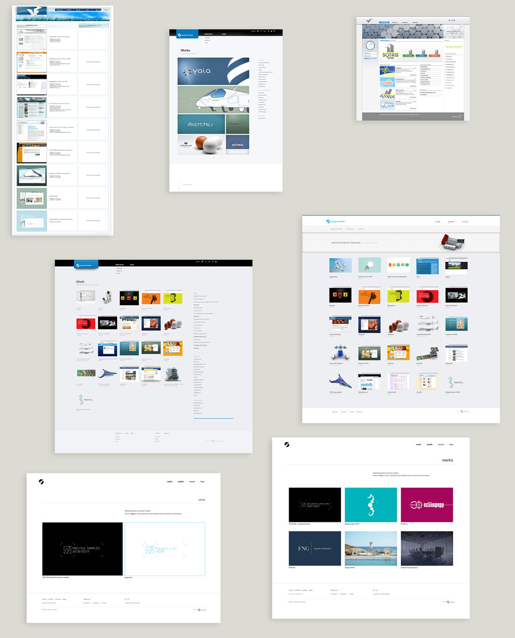
More specifically about presenting our portfolio. We work professionally in this field for more than 15 years and our website was always our main vehicle for showcasing our work and our capabilities. It has changed quite a few times and occasionally it swayed from having a rich portfolio of projects on display, to nothing but some teaser images or a list of clients and links. There is a reason for this inconsistency and the difficulty of having relevant and meaningfully presented work.

portfolio page through the years, from May 2007 to August 2021
At any given time, at least some (or maybe even all) of the projects we should present are in the process of updating, so what we are about to show could become obsolete very soon and won’t reflect the actual state of the project. Apart from that, there was always the fear that unless a substantial body of work is presented, it is better to not show anything because our agency’s image could appear lesser than it is. The latter is also addressed in the final chapter of this post but the way we dealt with these issues is the following.
Everything shown is finished work but at the same time it is always evolving.
For the ever-changing nature of the work we do for a client, we just decided to just show a snapshot of the current state regardless of what’s in the pipeline. At the same time, we use for our presentations the same method mentioned above, every case study has a version and a date, they will be updated continuously along the way, no need for waiting for something to ‘finish’. Everything shown is finished work but at the same time it is always evolving.
About the misrepresentation of our work when we show just a small part of the total body of it, the solution is simple: Just show what you can at any given time. The upside of showing good work in a meaningful manner is far more important than the fear of misrepresentation. After all, that fear may be unsubstantial as explained below. At the time this post is written we have online 5 case studies. Are those the complete body of our work? No. Are they representative? Of course. Are we proud of the work displayed here? Definitely.
§. WHY – Drop the mirror mask
This is the most personal part of this post but it may be the most important. During the last few years, I closely follow the work of Chris Do, a great designer and mentor, focusing mainly on business development for designers and design agencies. The following video is one of my favorites of his and I highly recommend it:
The main point of the video if I can attempt to provide a summary, is that we are all afraid and very cautious about the image we project over other people. We hold a mask of a supposedly better self, better than what we can actually show, in the hope that others will hold us on this exact stature.
But as Chris Do says “Everybody sees you exactly for who you are, they choose to either accept you or reject you, and there’s not much you can do”.
The effort to hold that mask is substantial, it is also damaging and ironically, nobody cares for it.
The precept from this video is to drop the mirror mask, kill your ego, ignore any internal insecurity and just be of service to people. If I may elaborate on this, one should try to be as transparent as possible for what they stand for and what they represent. This goes both to a personal and to a professional level as a business.
one should try to be as transparent as possible for what they stand for and what they represent
In conclusion to this quite big post, for many years we were over cautious of what to show in fear of how we will be perceived. Be that as it may, we were also very proud for the work we’ve done, the distance we have covered, and for the relationships we have built along the way. We are also very excited for our plans and for what we’re preparing for the future.
So why be so cautious, why not celebrate the work and the process? And why not, have more fun along the way!
Thank you for reading all this, I hope you found something useful, if you have any thoughts or feedback feel free to contact me.
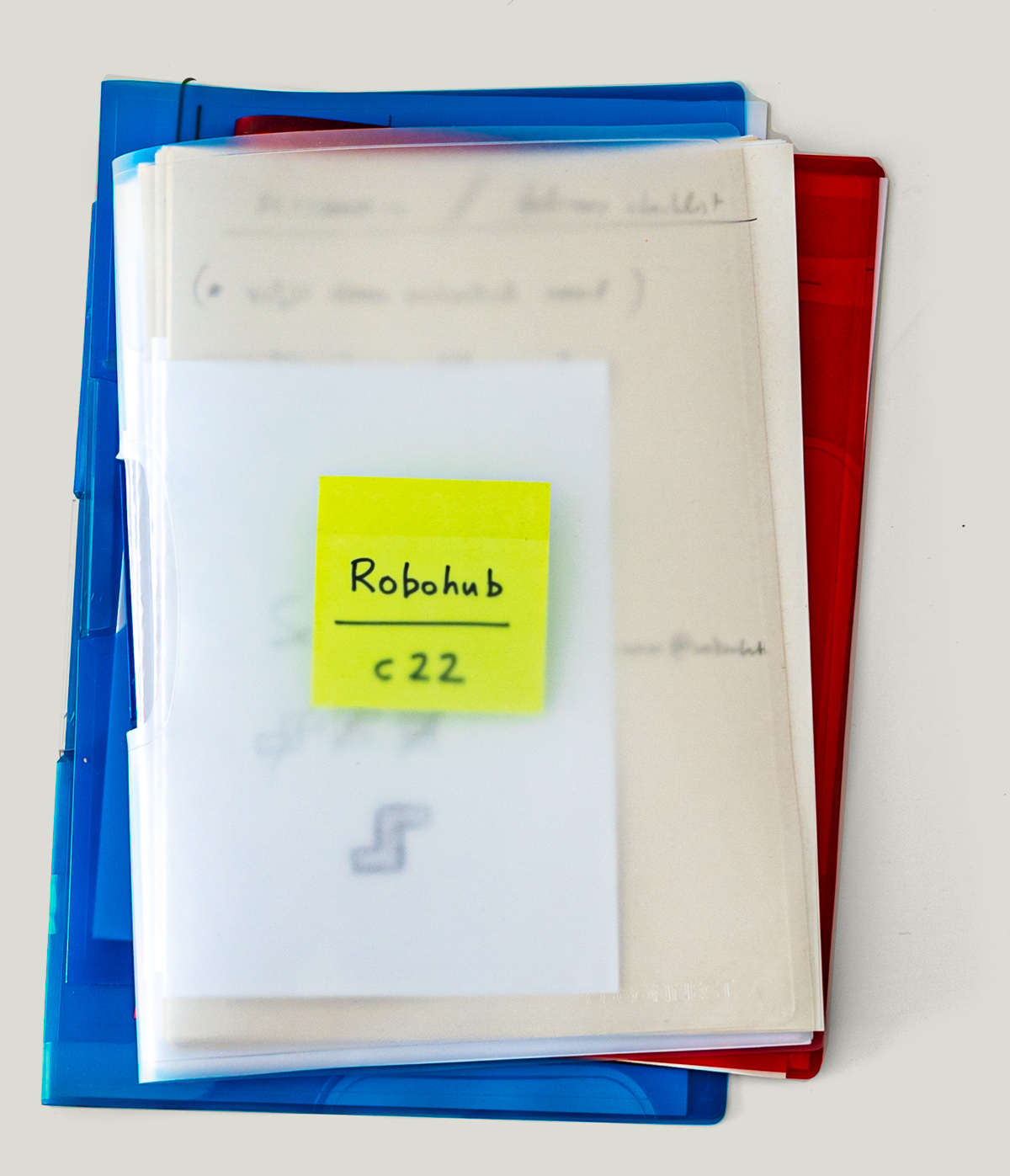
PS. cover image: a typical project folder, we use one for every project.
latest blog posts
MARTECMA 2026 New Year’s Dinner
a great opportunity to see our work on the association’s branding presented in such a prominent setting
‘2nd Nature’- photos
A few photos from the exhibition '2nd Nature' by Pieris.Architects and DpS Athens
‘2nd Nature’- landing page design
we designed the landing pages for the exhibition '2nd Nature' by Pieris.Architects and DpS Athens
AUAI – new brand for the organization behind AIhub and Robohub
This is the new logo for the Association for the Understanding of Artificial Intelligence or AUAI, a non-profit dedicated to providing free, high-quality information, direct from AI experts based in the UK.
Wakefield’s – design for a new cookie shop
brief presentation of the work we've done for Wakefields, a new bakery shop specialized on cookies, cookie dough, cookie milkshakes and other similar products.
Pieris family card
This is a very particular project, designing a family card is as personal as it gets.
Starting a small fun daily project!
What’s better than new year’s resolution? Starting a daily project for the new year and beyond !
Brochure design and product photography for Akron-Hellas
An 8-page brochure , designed on the occasion of AUTO TEC expo