Wakefield’s – design for a new cookie shop
This is a brief presentation of the work we’ve done for Wakefields, a new bakery shop specialized on cookies, cookie dough, cookie milkshakes and other similar products. This project had a very pressing timeline and quite a few pre-defined restrictions (ex the colours) that we had to follow. We designed the brand and all the necessary applications needed at this stage. We also provided consulting on the brand placement, on the shop design and layout.
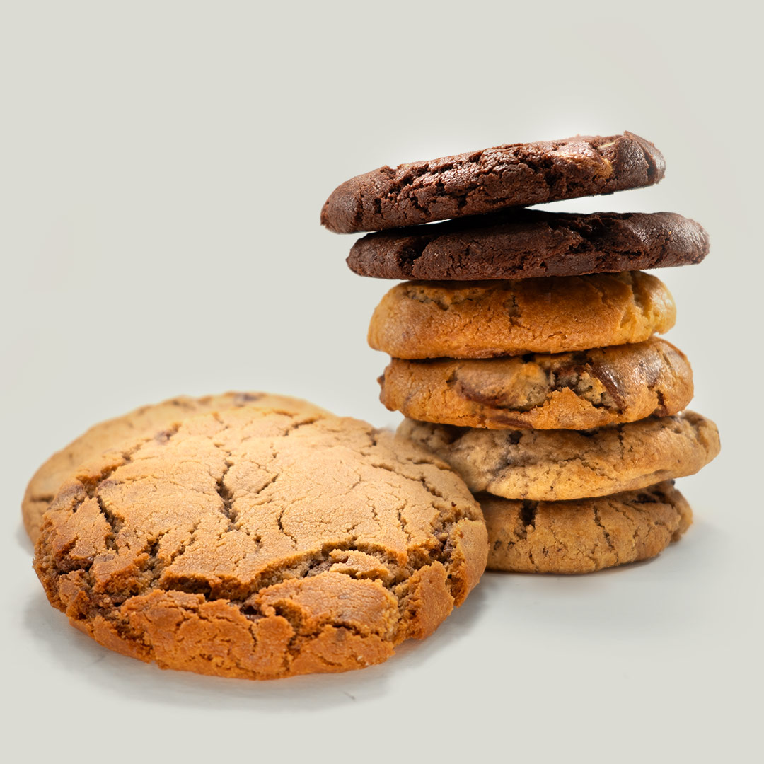
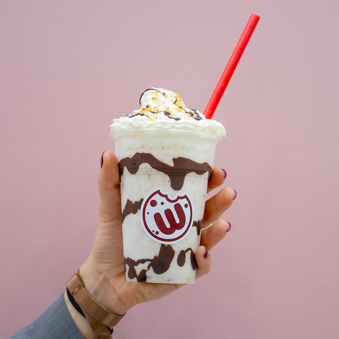
Photos were necessary for both printed and digital applications. We photographed the products on site due to their delicate and time-sensitive nature, you can see a few samples of these photos here. (All photos shown here are taken by us, unless mentioned otherwise.)
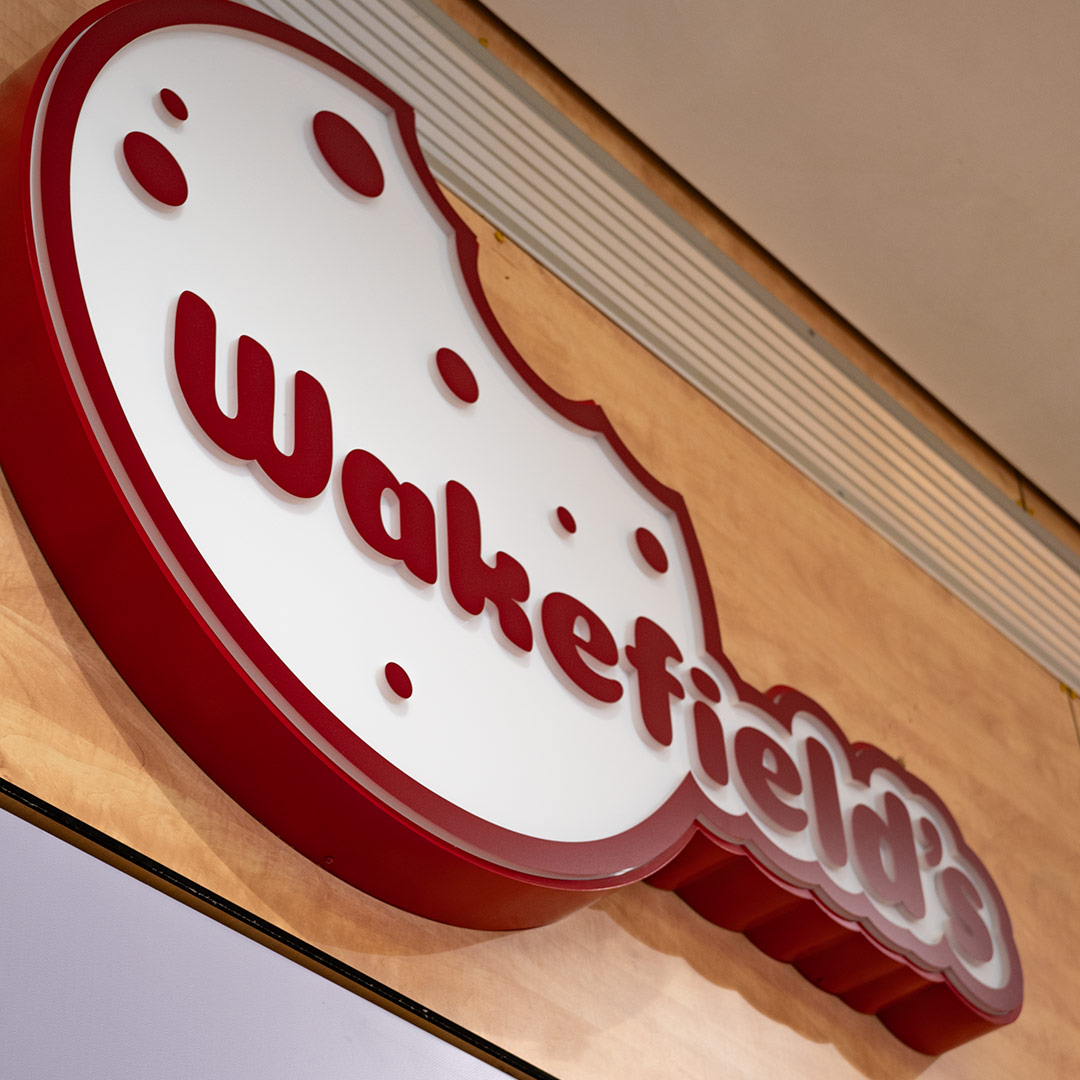
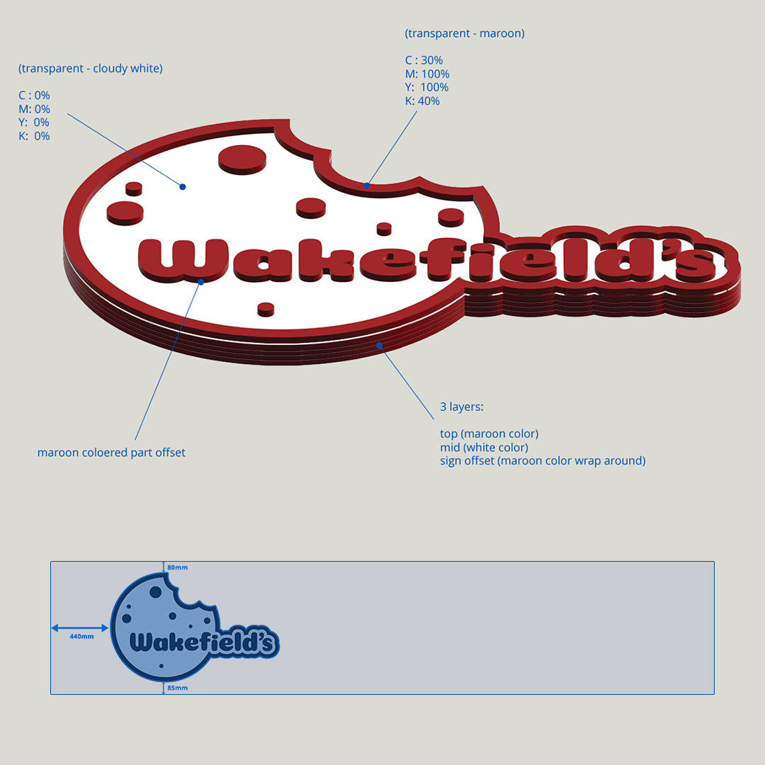
An important brand element in the shop is the plexiglass backlit sign. We designed the 3d version of the logo appropriate for this specific application and we provided the construction company with schematics and placement instructions.
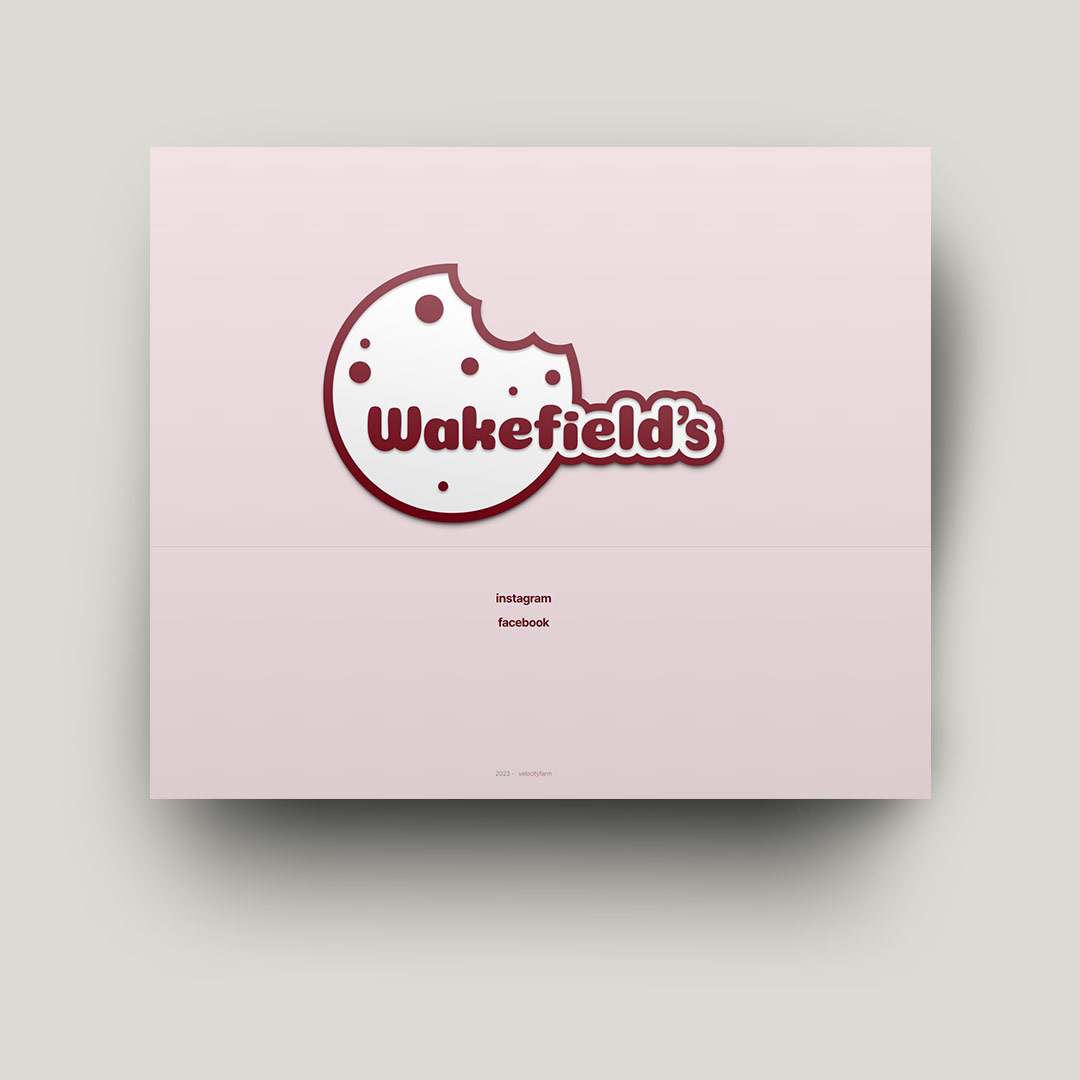
Some basic web elements were cretaed, a landing page website and the social media accounts.
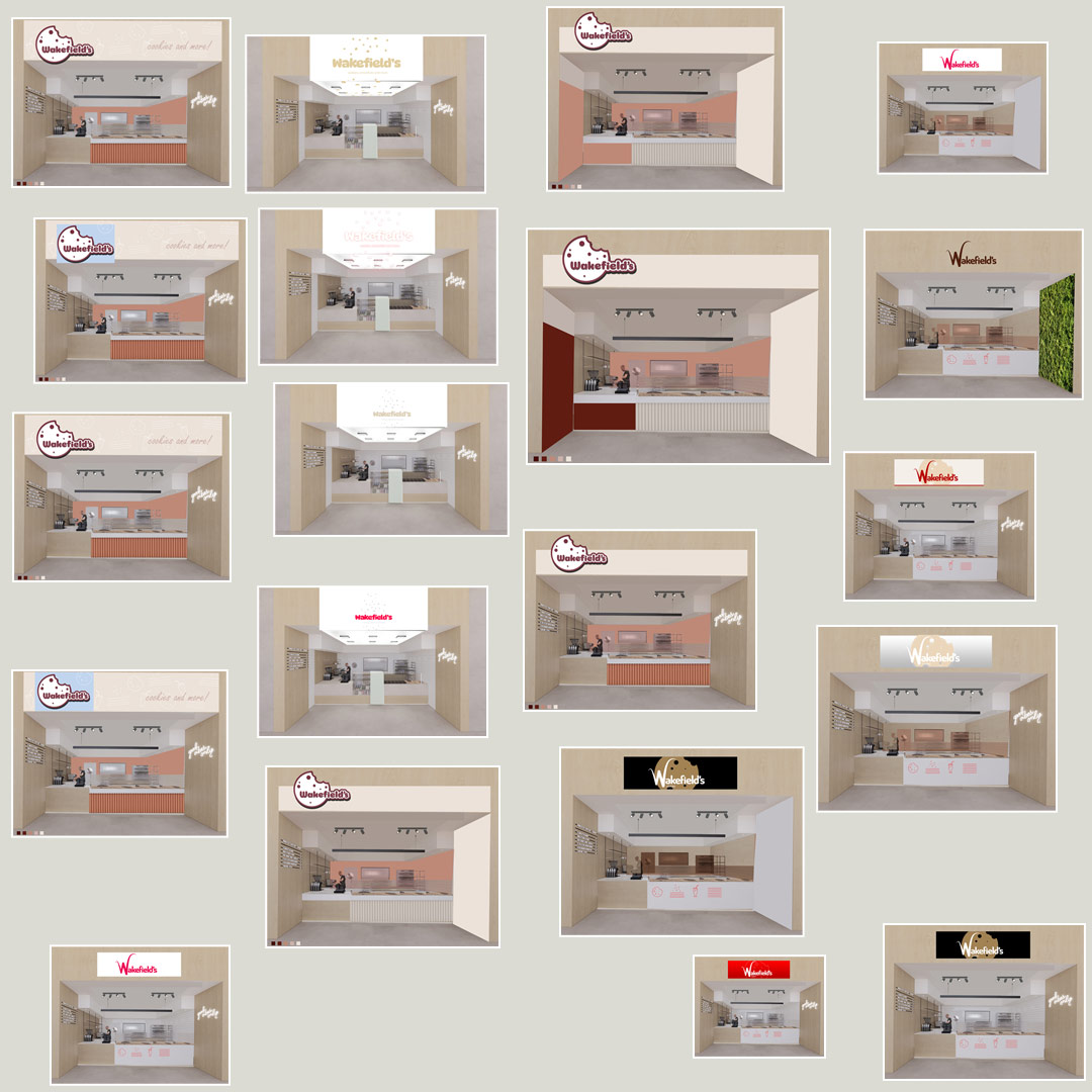
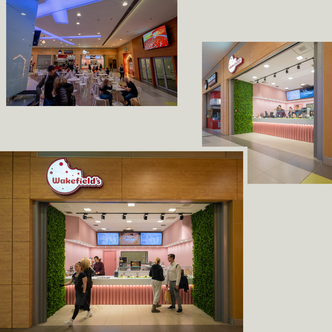
The final shop arrangement is decided by the client but we made numerous mockups based on some initial renders to assist the decision process.
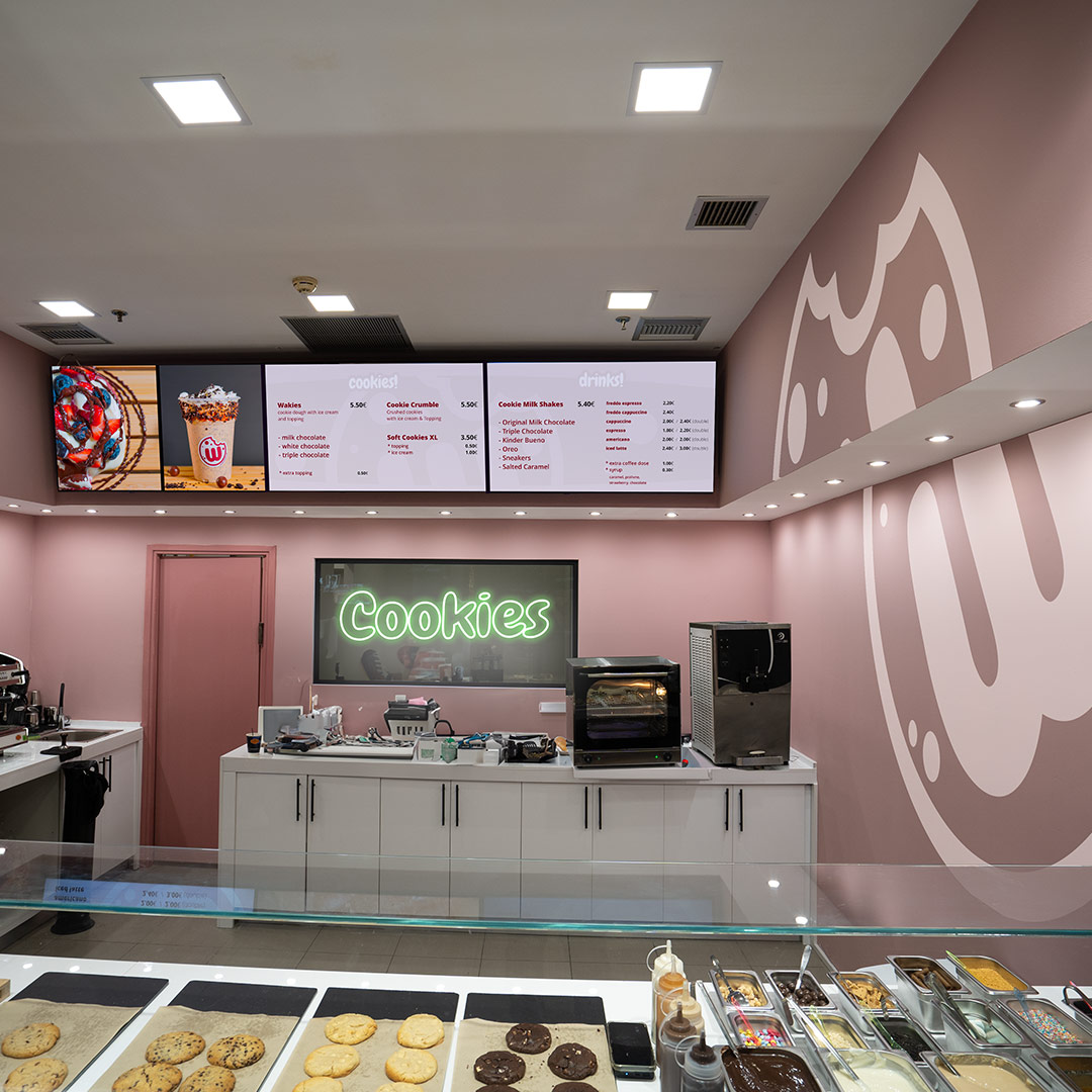
We created some proposals with easy to apply decals and signs for establishing the brand inside the shop. This is a sample pitch, one of many.
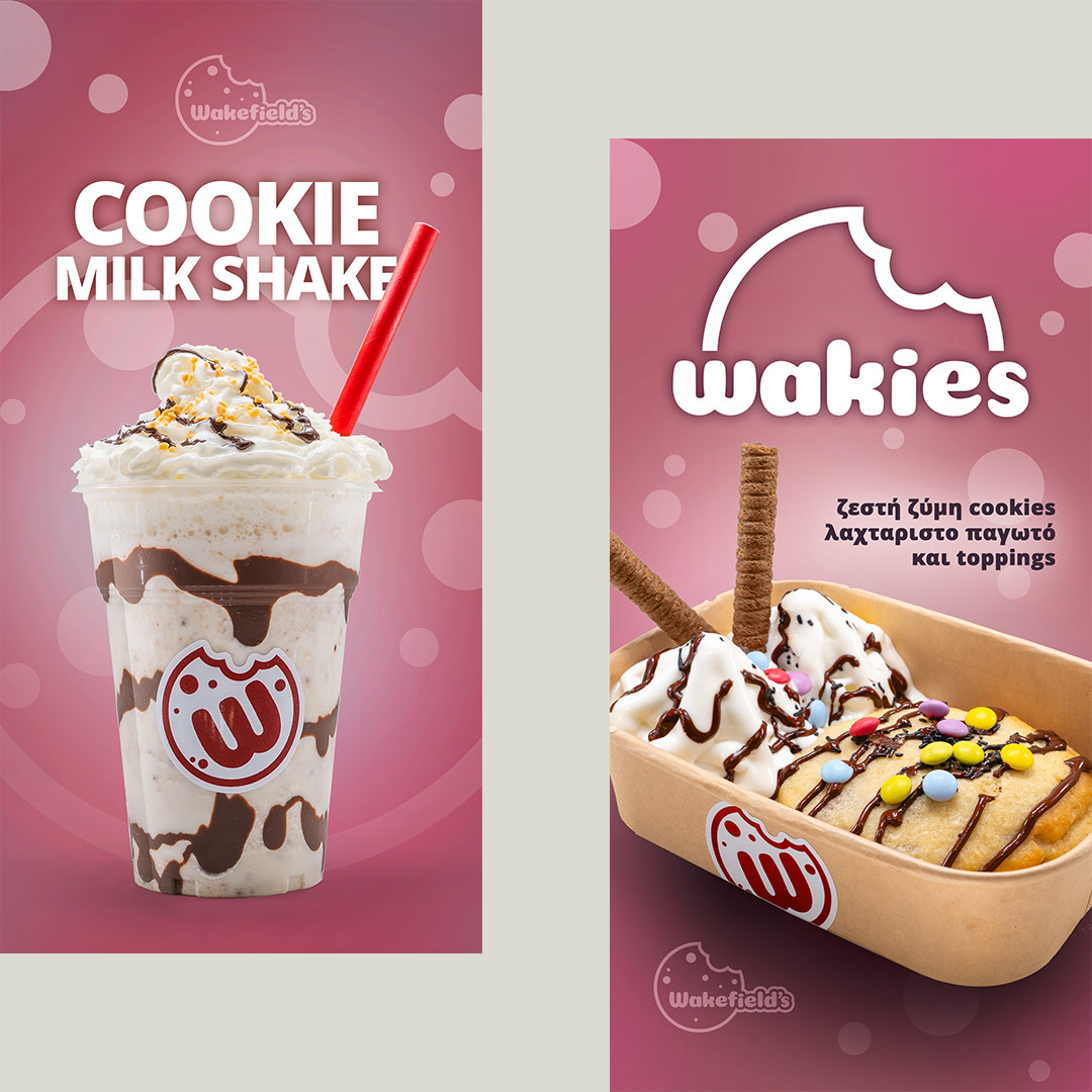
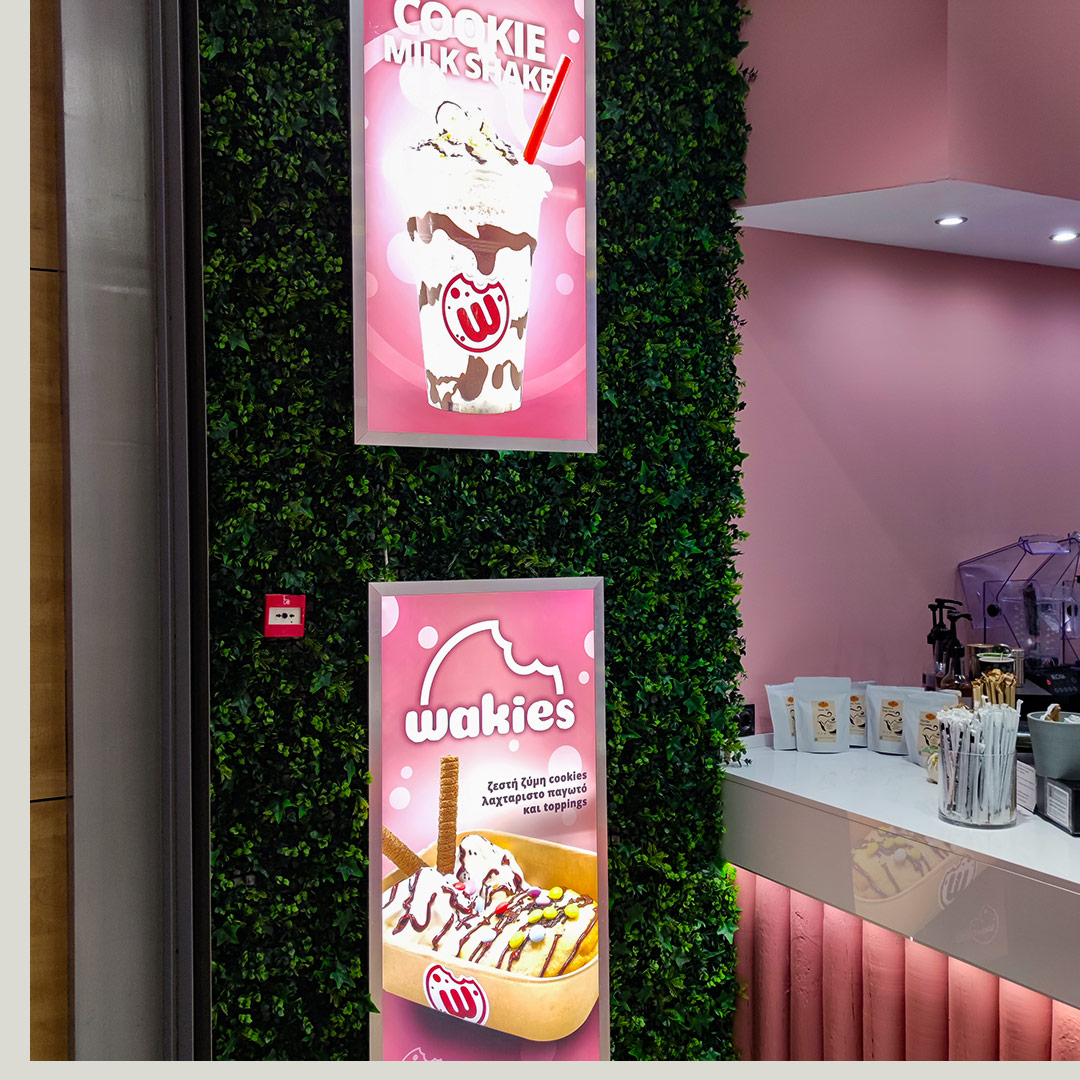
These two lightbox posters are the main promotional element that presents the flagship products to the customers. We shot the photographs on site and we also created a sub-logo for the main cookie dough-based product.
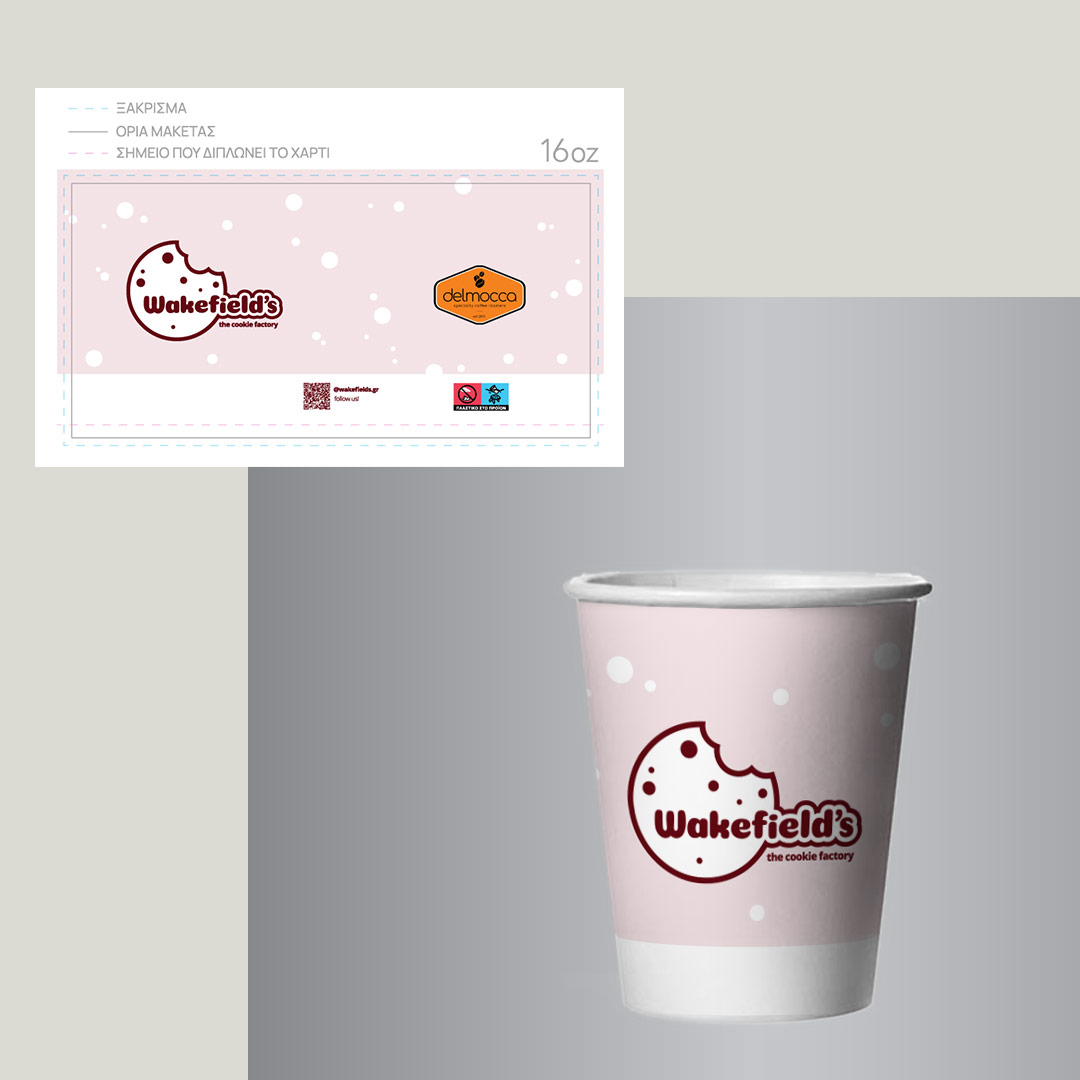
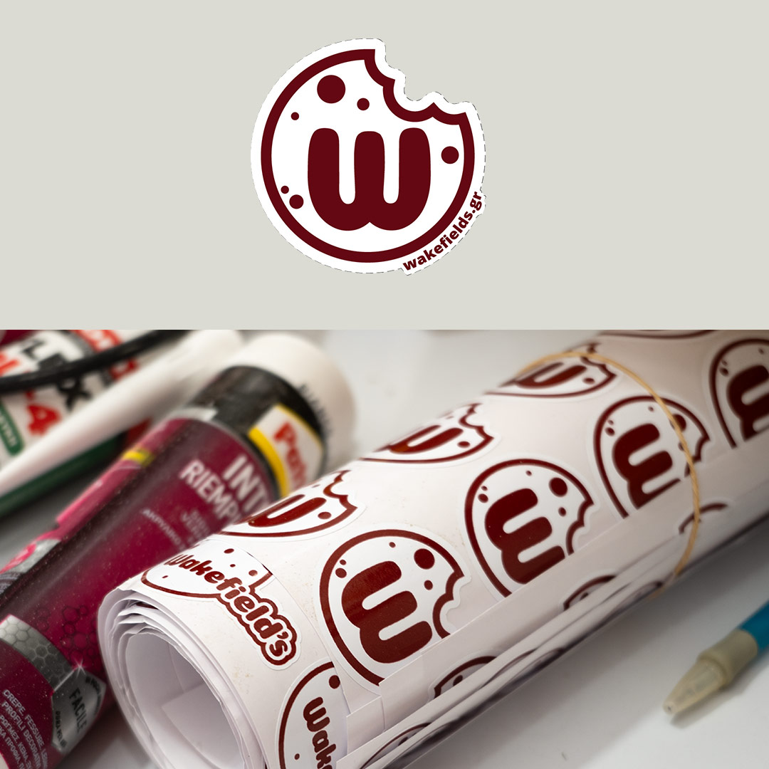
Packaging at this stage was mostly unlabeled cups and trays with stickers but this is the first custom branded design, as with most elements this was designed under specific guidelines.
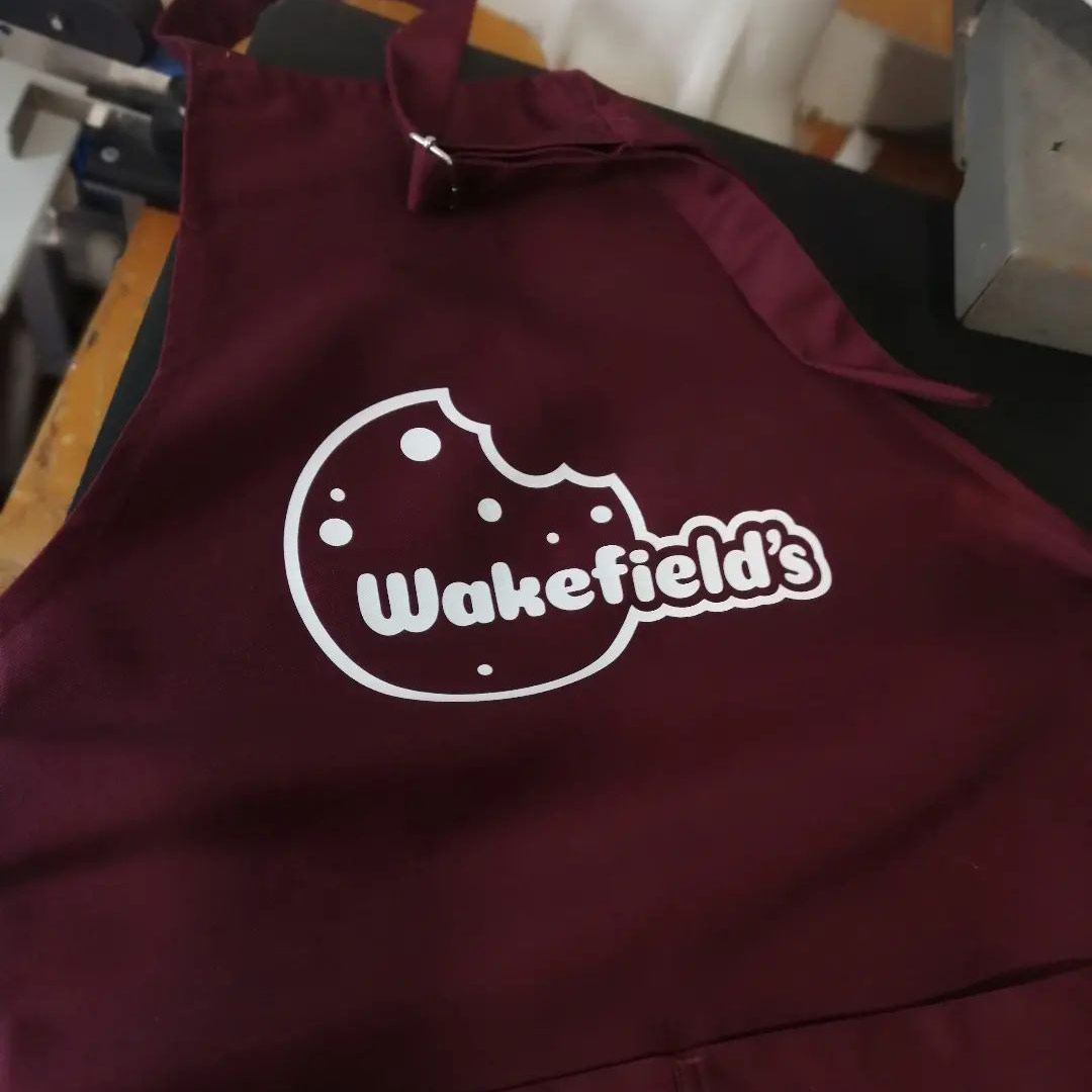
(apron printed by Ιδεότυπον, photo credit: Ιδεότυπον)
The personnel aprons follow the overall brand, this is the first version
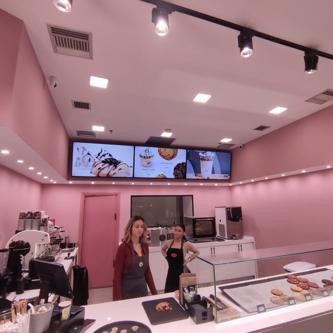
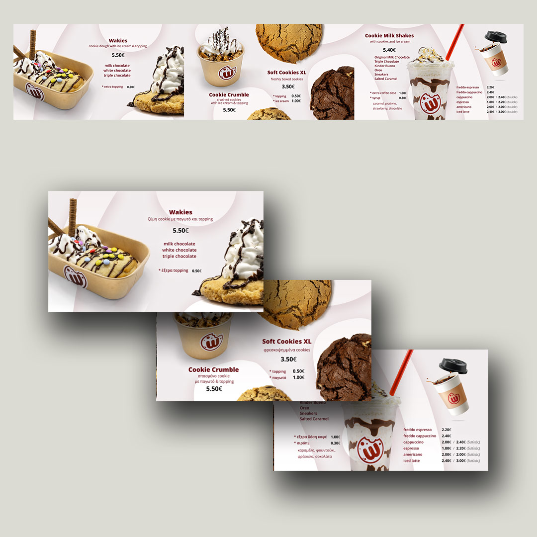
The shop features 3 large screens, we designed the menu and some simple animations, the 3 screens have a unified background but the switch asynchronically to images and brief videos. Apart from its functional role, this menu is the main promotional element and where the products are presented to the clients. We also edited the menu items to make them more clear and direct for the customers.
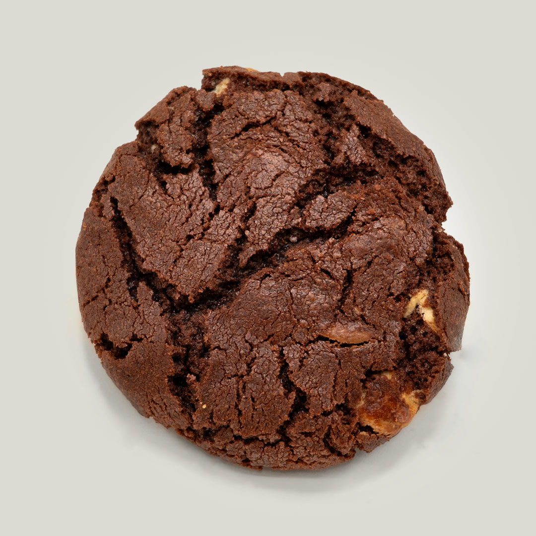
This presentation shows only elements that were delivered and used, the process lasted around two months and included a lot of experimentation during the design process and a roadmap along with a more elaborate brand design for a future expansion.The goal was to launch the shop and its brand on time.
You can taste the delicious Wakefield’s cookie products on Athens Metro mall!
latest blog posts
AUAI – new brand for the organization behind AIhub and Robohub
This is the new logo for the Association for the Understanding of Artificial Intelligence or AUAI, a non-profit dedicated to providing free, high-quality information, direct from AI experts based in the UK.
Pieris family card
This is a very particular project, designing a family card is as personal as it gets.
Starting a small fun daily project!
What’s better than new year’s resolution? Starting a daily project for the new year and beyond !
Thoughts on showcasing work
A collection of thoughts, what to display, how to do it and most importantly why.
Brochure design and product photography for Akron-Hellas
An 8-page brochure , designed on the occasion of AUTO TEC expo
Designing for 2019 Robot Launch startup competition
Since 2014, Robohub and Silicon Valley Robotics organize a competition for robotic startups. We designed its graphics package since its first year.
Deep Pixelation
A visual style with an overwhelming digital look.
hello world!
This is our new blog.