AUAI – new brand for the organization behind AIhub and Robohub

This is the new logo for the Association for the Understanding of Artificial Intelligence or AUAI, a non-profit dedicated to providing free, high-quality information, direct from AI experts based in the UK. The AUAI manages AIhub.org, and since it was founded by the same team behind the ROBOTS association that created Robohub.org the latter is now managed also by AUAI. Given that AIhub now was not AUAI’s only platform there was a need for a more distinct brand for it, that would simplify all the communication processes, make the message of the organization and the arrangement of each platform clearer.
Robohub.org was launched 12 years ago and we were involved from the start, designing its brand from the ground up. We did the same for AIhub that was launched a few years afterwards (as a separate entity) so the brand for AUAI followed the same aesthetic without being a simple derivative. The logo presented here is simple but bold, appropriate for the field of artificial intelligence and robotics.

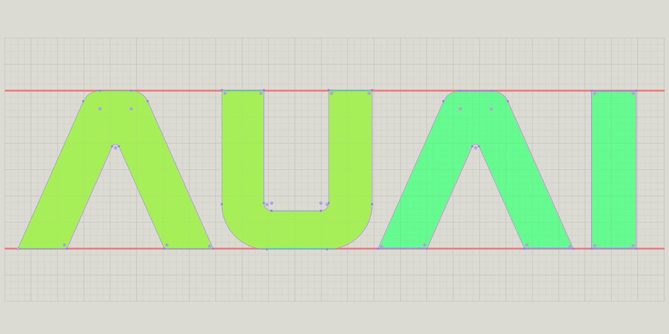
Being simple doesn’t mean that something is simplistic. As you can see in the diagram, a lot of work is necessary for something to appear simple but just right. We pay attention to even the most tiny details, this typeface is design specifically for this logo (the logos for AIhub and Robohub have also custom typefaces designed specifically for them).
Every tiny radius or dimension is fine tuned until they look right. We start with an analytical geometric approach but quite often the geometry must be adjusted by eye. If you are observative enough you can spot the difference where the letters overlap with the underlined red lines, the letters don’t have exactly the same height, if they did they would have looked uneven.

The logos and the brand design for AIhub and Robohub even though they are not new (Robohub’s is already 12 years old!) they still serve their purpose with only minor adjustments needed from time to time. Each platform should have its own character so their respective brands do not need to look exactly the same, they just need to have to be perceived as parts of the same family. That goes to other AUAI projects, like scicomm.io.

Like most of our clients, we have a continuous relationship with AUAI, during these years we have designed and developed a lot of cool stuff, and we are very excited for what we’re preparing next. If you are interested in robotics and AI take a look at Robohub.org and AIhub.org !
latest blog posts
MARTECMA 2026 New Year’s Dinner
a great opportunity to see our work on the association’s branding presented in such a prominent setting
‘2nd Nature’- photos
A few photos from the exhibition '2nd Nature' by Pieris.Architects and DpS Athens
‘2nd Nature’- landing page design
we designed the landing pages for the exhibition '2nd Nature' by Pieris.Architects and DpS Athens
Wakefield’s – design for a new cookie shop
brief presentation of the work we've done for Wakefields, a new bakery shop specialized on cookies, cookie dough, cookie milkshakes and other similar products.
Pieris family card
This is a very particular project, designing a family card is as personal as it gets.
Starting a small fun daily project!
What’s better than new year’s resolution? Starting a daily project for the new year and beyond !
Thoughts on showcasing work
A collection of thoughts, what to display, how to do it and most importantly why.
Brochure design and product photography for Akron-Hellas
An 8-page brochure , designed on the occasion of AUTO TEC expo